
Module 3: Exploratory Data Analysis
Exploratory Data Analysis (EDA) using Python
Exploratory Data Analysis (EDA) is an essential step in understanding and summarizing the main characteristics of a dataset. It helps uncover relationships between variables and identifies key factors impacting the target variable.
1. Descriptive Statistics
Descriptive statistics provide a summary of the data's main characteristics. It includes measures like mean, median, mode, and standard deviation.
2. GroupBy Operations
GroupBy operations allow us to group data based on categorical variables and perform aggregations or transformations.
3. Data Visualization Commands in Python
Visualizations play a key role in data analysis. Various forms of graphs and plots can be created with data in Python to aid in visualizing and analyzing data effectively. The two major libraries used for this purpose are matplotlib and seaborn.
4. Correlation Analysis
Correlation analysis measures the relationship between variables. It helps identify how changes in one variable are associated with changes in another.
5. Advanced Correlation Methods (Correlation Statistics)
5.1 Pearson Correlation
Pearson correlation coefficient measures the linear relationship between two variables. It ranges from -1 to 1, where 1 indicates a strong positive correlation, -1 indicates a strong negative correlation, and 0 indicates no linear correlation.
5.2 Correlation Heatmaps
Correlation heatmaps provide a visual representation of the correlation matrix. They use color gradients to indicate the strength and direction of correlations between variables
1. Descriptive Statistics in Data Analysis
Descriptive statistics are a crucial first step in exploring your data before building complex models. They provide a summary of your dataset, helping you understand its basic features and distribution.
Descriptive Statistical Analysis
Descriptive statistical analysis helps describe the basic features of a dataset, offering a summary of the sample and measures of the data
Using describe Function
The describe function in pandas computes basic statistics for all numerical variables in your data frame, including:
- Mean
- Total number of data points
- Standard deviation
- Quartiles
- Extreme values
NaN values are automatically skipped in these statistics.
df.describe()Example Output
             price  engine-size  horsepower     length      width
count      5.00000     5.000000    5.000000   5.000000   5.000000
mean   15329.00000   132.600000  118.400000  170.100000  64.480000
std     1570.38349    17.782794   21.800460   7.928386   0.396108
min    13495.00000   109.000000  102.000000  157.300000  63.900000
25%    13950.00000   130.000000  110.000000  168.800000  64.100000
50%    15250.00000   136.000000  111.000000  171.200000  64.800000
75%    16500.00000   136.000000  115.000000  176.600000  64.800000
max    17450.00000   152.000000  154.000000  176.600000  64.800000
Categorical Variables
Categorical variables can be divided into different categories or groups and have discrete values. For example, the drive system in a car dataset may consist of categories like forward wheel-drive, rear wheel-drive, and four wheel-drive.
Summarizing Categorical Data
The value_counts function summarizes categorical data.
df['drive-wheels'].value_counts()Example Output of value_counts Function
front-wheel-drive 118
rear-wheel-drive 75
four-wheel-drive 8
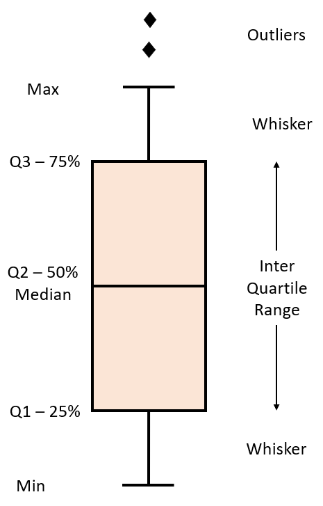
Name: drive-wheels, dtype: int64Box Plots
Box plots visualize numeric data distributions and highlight the following features:
- Median
- Upper quartile (75th percentile)
- Lower quartile (25th percentile)
- Inter-quartile range (IQR)
- Lower and upper extremes (calculated as 1.5 times the IQR above the 75th percentile and below the 25th percentile)
- Outliers
Box plots help compare distributions between groups.
import seaborn as sns
sns.boxplot(x='drive-wheels', y='price', data=df)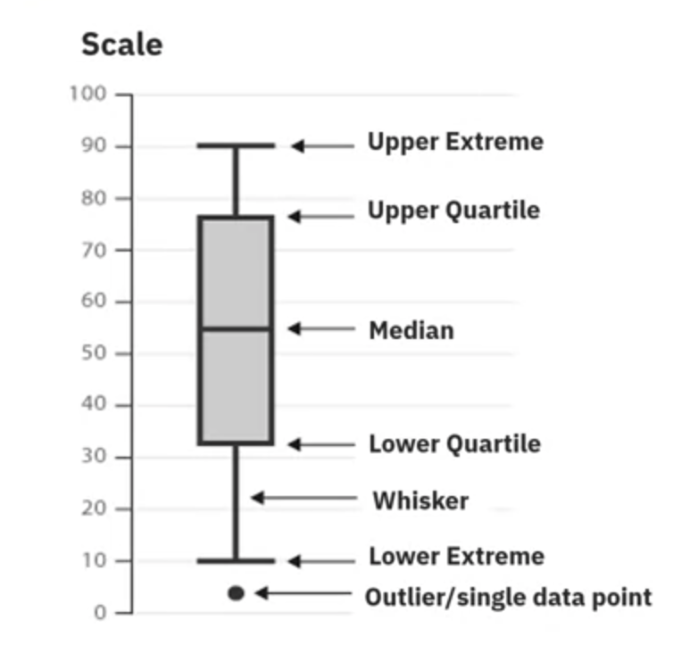
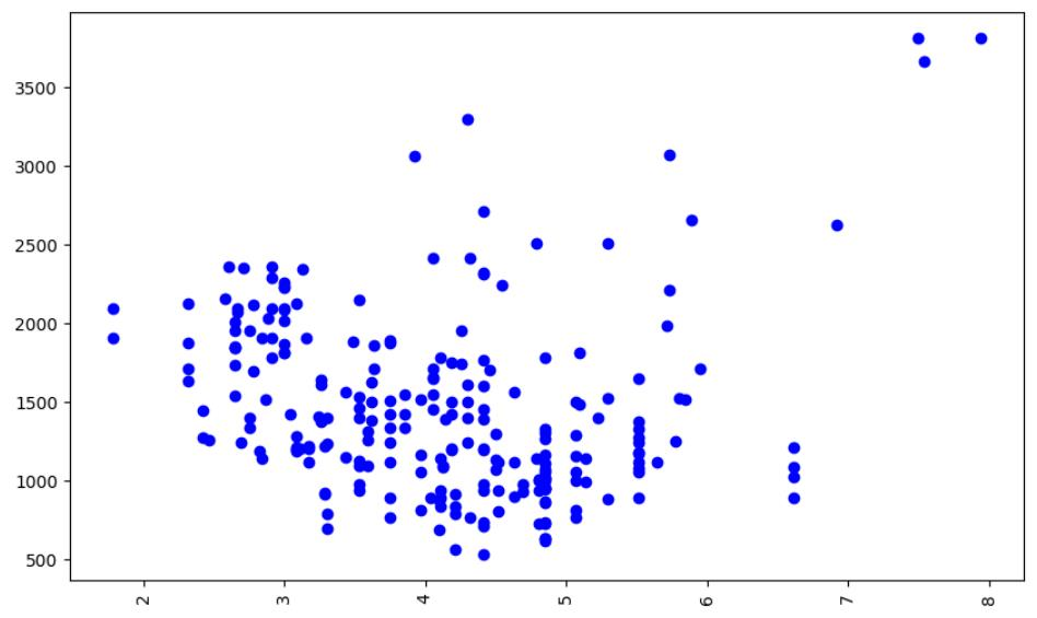
Scatter Plots
Scatter plots visualize the relationship between two continuous variables. They help identify how changes in one variable are associated with changes in another.
- Predictor Variable: The variable used to predict an outcome (e.g., engine size).
- Target Variable: The variable being predicted (e.g., car price).
In a scatter plot:
- Predictor variable is plotted on the x-axis.
- Target variable is plotted on the y-axis.
import matplotlib.pyplot as plt

plt.scatter(df['engine-size'], df['price'])
plt.xlabel('Engine Size')
plt.ylabel('Price')
plt.title('Scatterplot of Engine Size vs Price')
plt.show()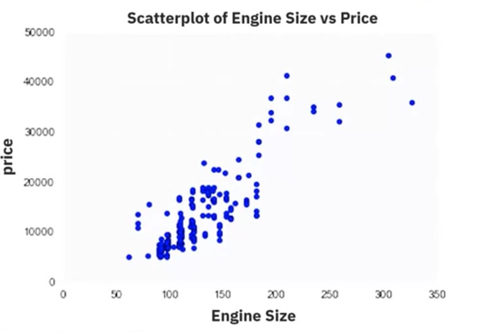
From the scatter plot, you can observe that as engine size increases, the price of the car also increases, indicating a positive linear relationship.
2. Exploring GroupBy and Pivot Tables in Pandas
Overview
This guide covers the basics of grouping data and transforming datasets using Pandas. The focus is on understanding the relationship between different types of drive systems (forward, rear, and four-wheel drive) and the price of vehicles. It explores the groupby method, creating pivot tables, and visualizing data using heatmaps.
Grouping Data with GroupBy
The groupby method in Pandas is used to group data based on categorical variables, allowing for comparison of different categories by aggregating data. This example demonstrates how to group data by drive wheels and body style to find the average price of vehicles.
Example Code
import pandas as pd

# Selecting relevant columns
df_group = df[['drive-wheels', 'body-style', 'price']]

# Grouping by 'drive-wheels' and 'body-style', then calculating the mean price
grouped_test1 = df_group.groupby(['drive-wheels', 'body-style'], as_index=False).mean()
grouped_test1 = grouped_test1[['drive-wheels', 'body-style', 'price']]
grouped_test1.head()
Example Output
    drive-wheels   body-style   price
0  4wd           hatchback     7603.0
1  fwd           convertible   11595.0
2  fwd           hardtop       8249.0
3  fwd           hatchback     8396.4
4  fwd           sedan         9811.5
Creating Pivot Tables
To make grouped data easier to understand, it can be transformed into a pivot table. A pivot table displays one variable along the columns and another variable along the rows, making the data easier to visualize and interpret.
Example Code
# Creating a pivot table
grouped_pivot = grouped_test1.pivot(index='drive-wheels', columns='body-style', values='price')
Example Output
price
body-style convertible hardtop hatchback sedan wagon
drive-wheels
4wd NaN NaN 7603.0 NaN NaN
fwd 11595.0 8249.0 8396.4 9811.5 9997.8
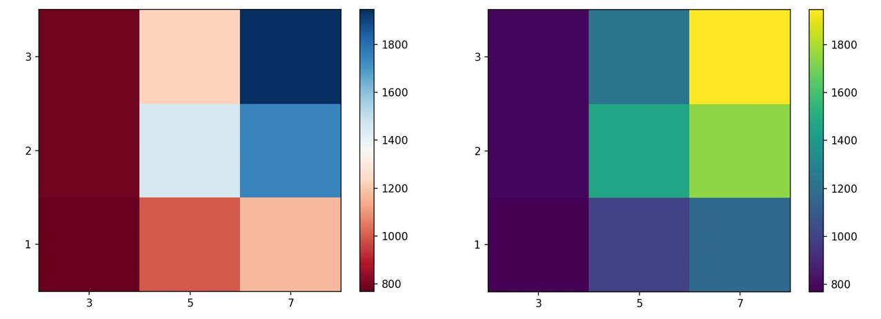
rwd 23949.6 15645.0 14364.4 21711.0 16994.2Visualizing Data with Heatmaps
Heatmaps provide a graphical representation of data where individual values are represented by colors, helping in identifying patterns and relationships in the data.
Example Code
import matplotlib.pyplot as plt
import seaborn as sns

# Creating a heatmap
plt.figure(figsize=(8, 6))
sns.heatmap(grouped_pivot, cmap='RdBu', annot=True)
plt.title('Title')
plt.show()
Example Output
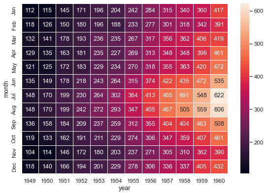
Using the groupby method, pivot tables, and heatmaps provides valuable insights into the relationships between different variables in the dataset.
3. Data Visualization commands in Python
Visualizations play a key role in data analysis. This section introduces various forms of graphs and plots that you can create with your data in Python, aiding in visualizing data for better analysis.
The two major libraries used to create plots are Matplotlib and Seaborn. We will learn the prominent plotting functions of both these libraries as applicable to Data Analysis.
Importing Libraries
You can import the libraries as shown below.
Matplotlib
from matplotlib import pyplot as pltAlternatively, the command can also be written as:
import matplotlib.pyplot as pltMost of the plots of interest are contained in the pyplot subfolder of the package. Matplotlib functions return a plot object which requires additional statements to display. While using Matplotlib in Jupyter Notebooks, it is essential to add the following 'magic' statement after loading the library to display graphs inside the notebook interface.
%matplotlib inlineSeaborn
Seaborn is usually imported using the following statement:
import seaborn as snsMatplotlib Functions
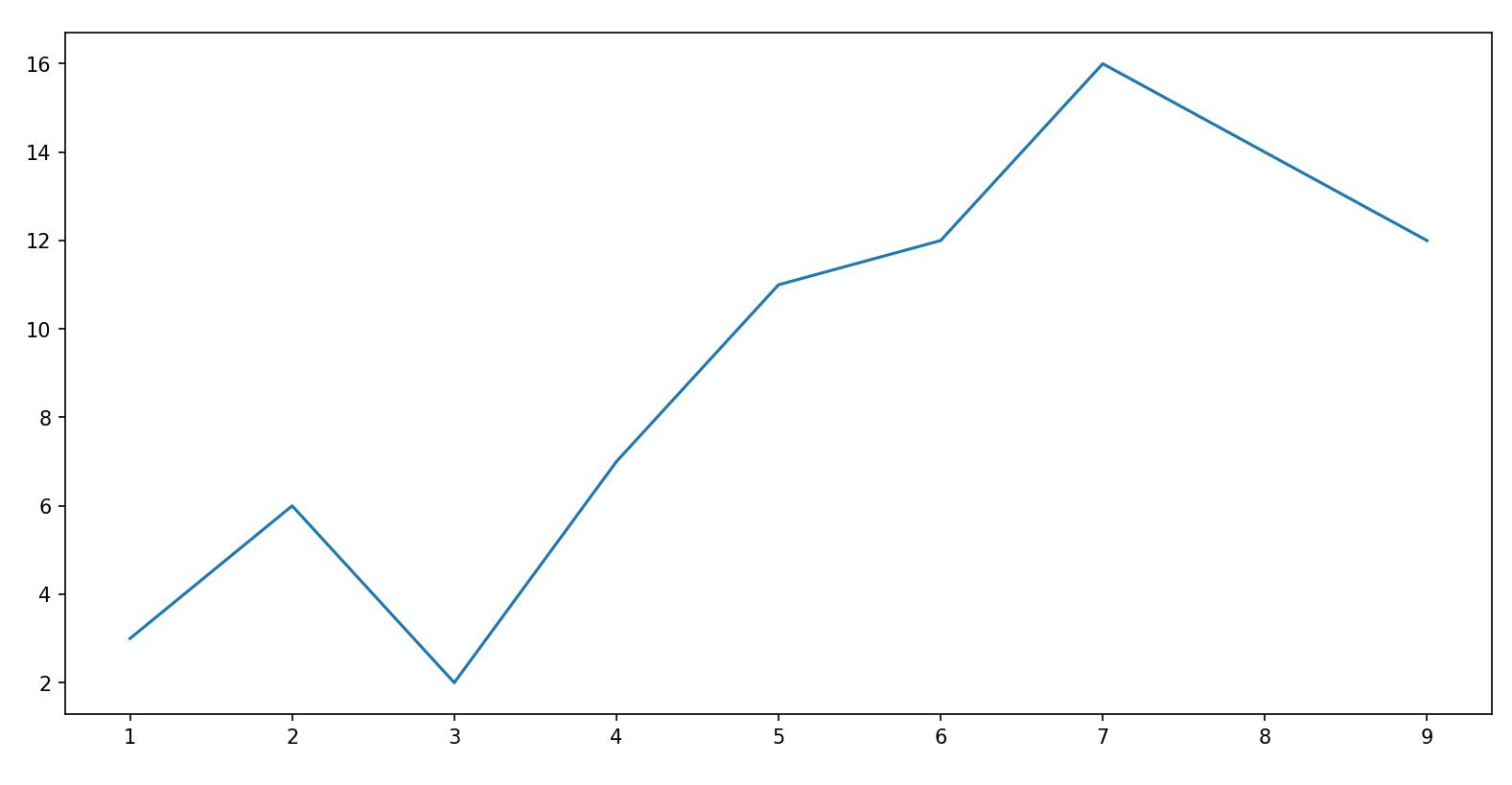
1. Standard Line Plot
The simplest and most fundamental plot is a standard line plot. The function expects two arrays as input, x and y, both of the same size. x is treated as an independent variable and y as the dependent one. The graph is plotted as the shortest line segments joining the x, y point pairs ordered in terms of the variable x.
Syntax:
plt.plot(x, y)Example Output:
2. Scatter Plot
Scatter plots present the relationship between two variables in a dataset. It represents data points on a two-dimensional plane. The independent variable or attribute is plotted on the X-axis, while the dependent variable is plotted on the Y-axis.
Syntax:
plt.scatter(x, y)Example Output:
3. Histogram
A histogram is an important visual representation of data in categorical form. To view the data in a "Binned" form, use the histogram plot with a number of bins required or with the data points that mark the bin edges. The x-axis represents the data bins, and the y-axis represents the number of elements in each bin.
Syntax:
plt.hist(x, bins)Example Output:
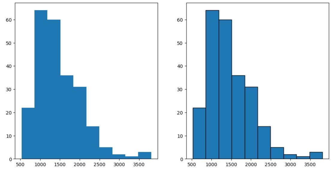
Use an additional argument, edgecolor, for better clarity of plot.
4. Bar Plot
A bar plot is used for visualizing categorical data. The y-axis represents the number of values belonging to each category, while the x-axis represents the different categories.
Syntax:
plt.bar(x, height)Example Output:
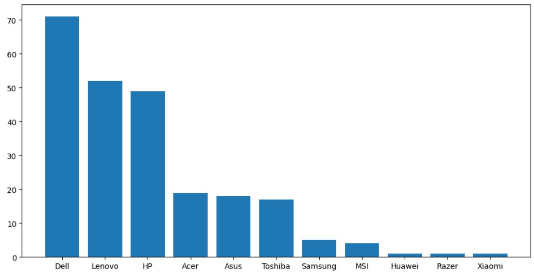
Here, x is the categorical variable, and height is the number of values belonging to the category. You can adjust the width of each bin using an additional width argument in the function.
5. Pseudocolor Plot
A pseudocolor plot displays matrix data as an array of colored cells (known as faces). This plot is created as a flat surface in the x-y plane. The surface is defined by a grid of x and y coordinates that correspond to the corners (or vertices) of the faces. Matrix C specifies the colors at the vertices.
Syntax:
plt.pcolor(C)You can define an additional cmap argument to specify the color scheme of the plot.
Example Output:
Seaborn Functions
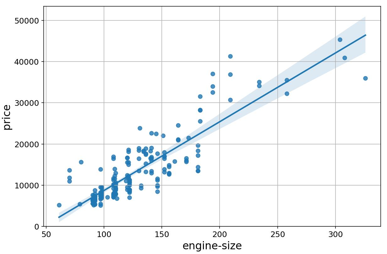
1. Regression Plot
A regression plot draws a scatter plot of two variables, x and y, and then fits the regression model and plots the resulting regression line along with a 95% confidence interval for that regression.
Syntax:
sns.regplot(x='header_1', y='header_2', data=df)Example Output:
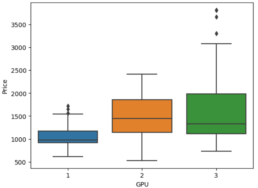
2. Box and Whisker Plot
A box plot shows the distribution of quantitative data in a way that facilitates comparisons between variables or across levels of a categorical variable. The box shows the quartiles of the dataset while the whiskers extend to show the rest of the distribution, except for points that are determined to be "outliers".
Syntax:
sns.boxplot(x='header_1', y='header_2', data=df)Example Output:
3. Residual Plot
A residual plot is used to display the quality of polynomial regression. This function regresses y on x as a polynomial regression and then draws a scatter plot of the residuals.
Syntax:
sns.residplot(data=df, x='header_1', y='header_2')Alternatively:
sns.residplot(x=df['header_1'], y=df['header_2'])Example Output:
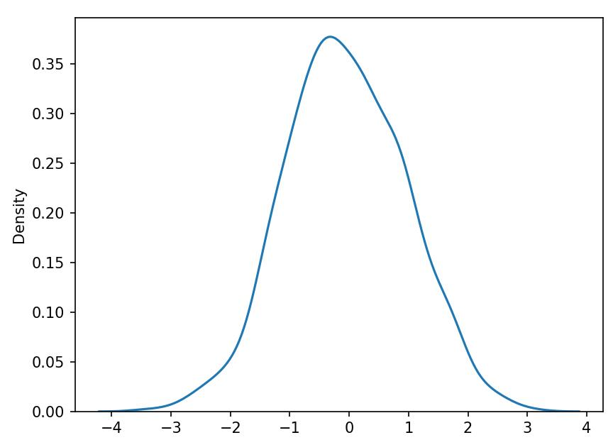
4. KDE Plot
A Kernel Density Estimate (KDE) plot is a graph that creates a probability distribution curve for the data based upon its likelihood of occurrence on a specific value. This is created for a single vector of information.
Syntax:
sns.kdeplot(X) || sns.kdeplot(df['age'])Example Output:
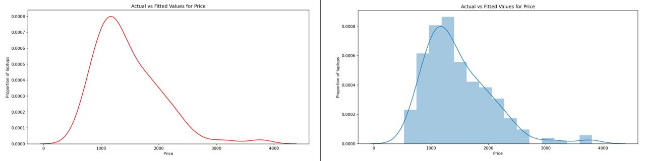
5. Distribution Plot
This plot has the capacity to combine the histogram and the KDE plots. This plot creates the distribution curve using the bins of the histogram as a reference for estimation. You can optionally keep or discard the histogram from being displayed.
Syntax:
sns.distplot(X, hist=False)Keeping the argument hist as True would plot the histogram along with the distribution plot.
Example Output:
4. Correlation Between Variables
Correlation is a statistical measure of the extent to which different variables are interdependent. It indicates how changes in one variable are associated with changes in another variable over time.
Positive Correlation
Positive correlation indicates that as one variable increases, the other variable also tends to increase.
Example: Engine Size and Price
- Positive Correlation: Engine size increases, price also increases.
- Visualization: Scatter plot with a steep positive slope.
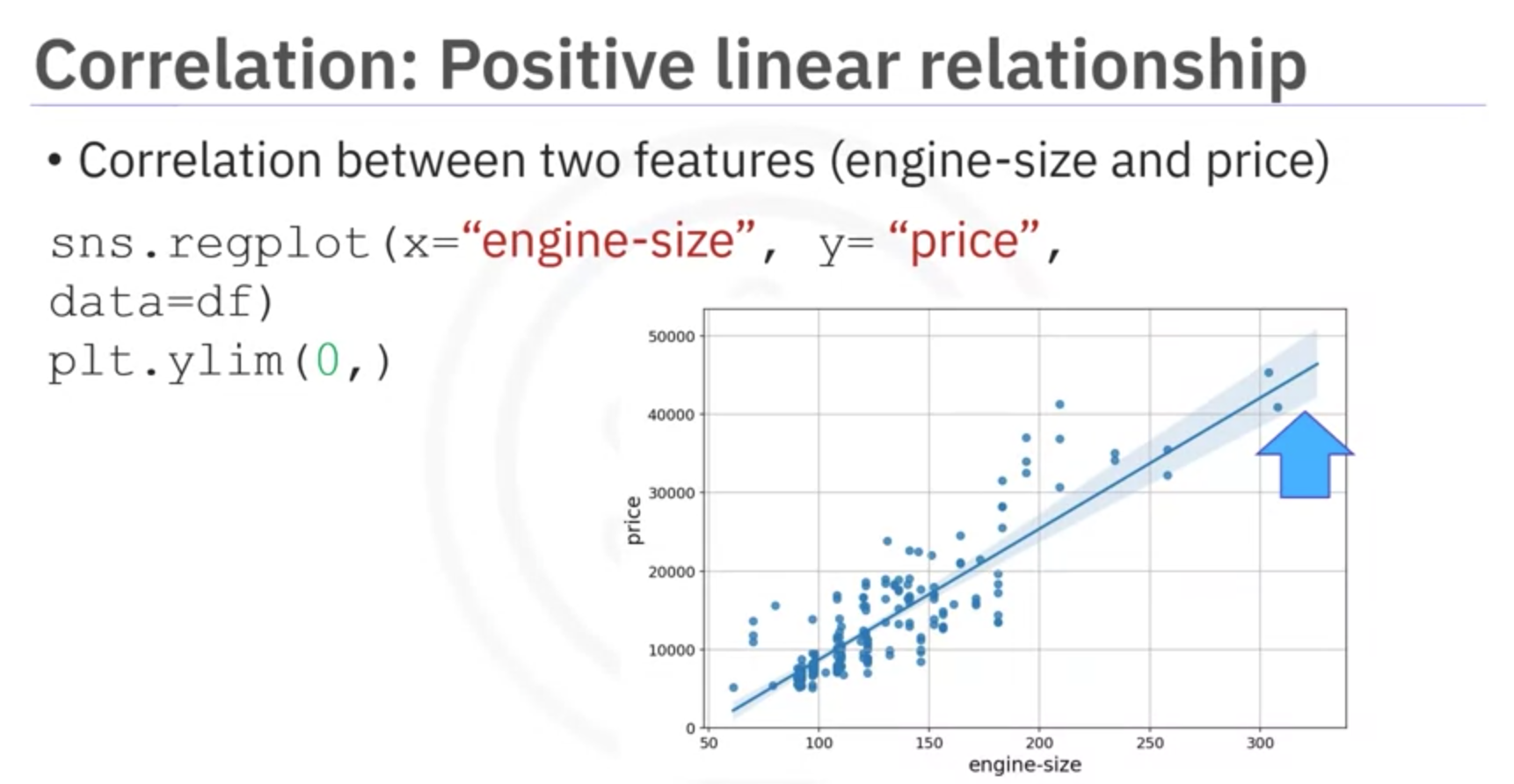
Explanation: When engine size increases, there is a corresponding increase in the price of the vehicle. This positive correlation suggests that larger engines tend to be associated with higher prices in the market.
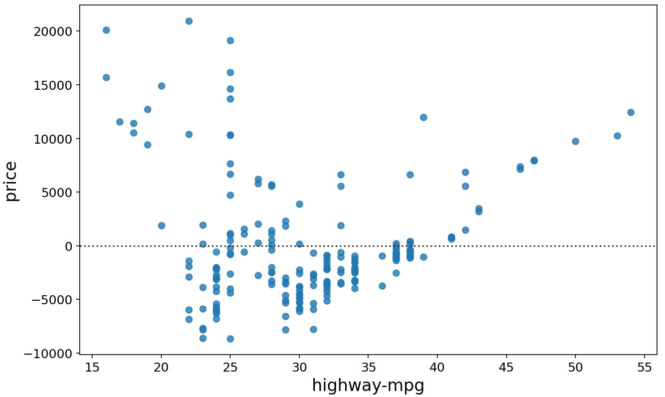
Negative Correlation
Negative correlation indicates that as one variable increases, the other variable tends to decrease.
Example: Highway Miles per Gallon and Price
- Negative Correlation: As highway miles per gallon increases, price decreases.
- Visualization: Scatter plot with a steep negative slope.
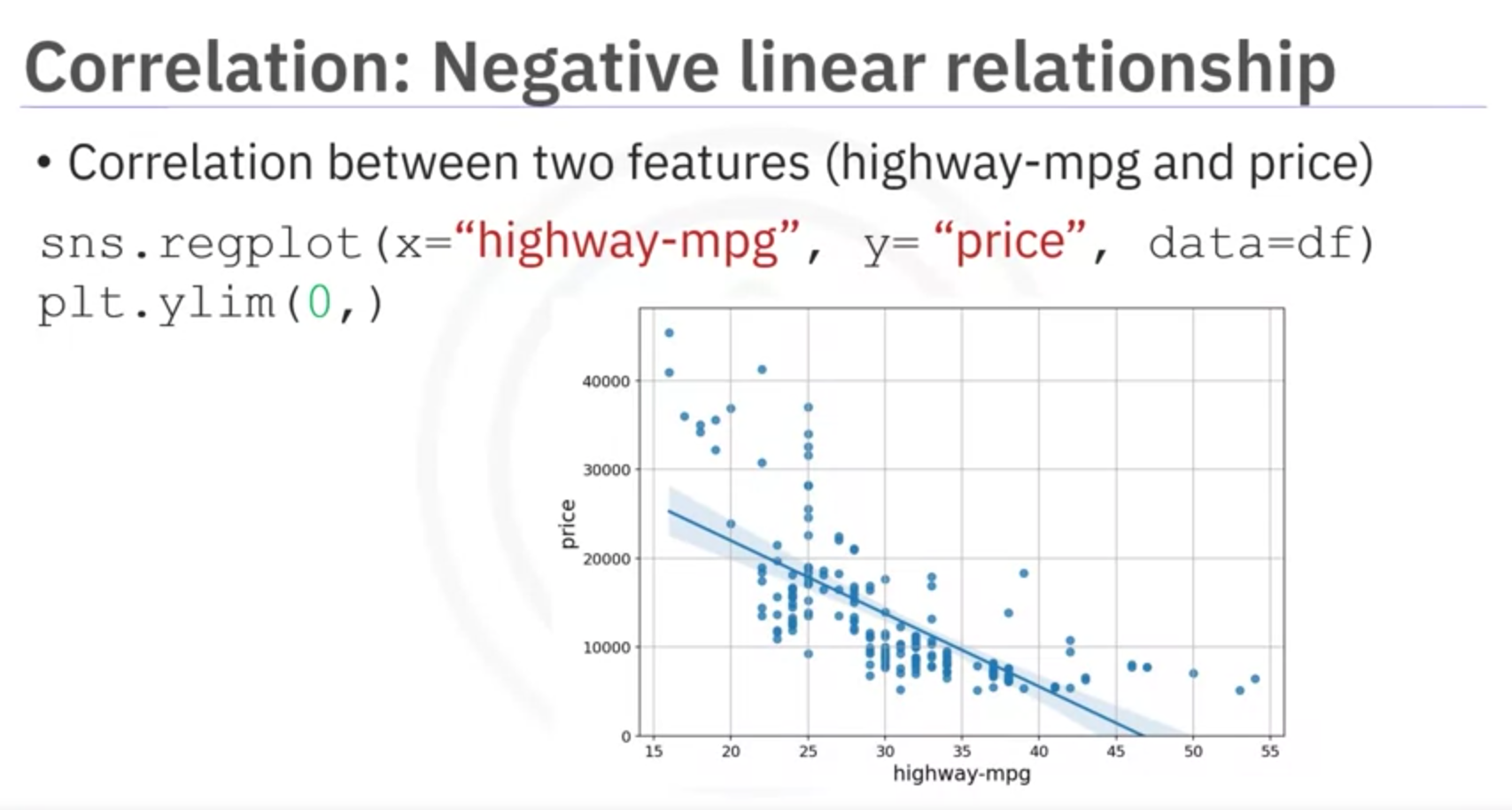
Explanation: When highway miles per gallon increases, the price of the vehicle tends to decrease. This negative correlation suggests that cars with higher fuel efficiency (more miles per gallon) are generally priced lower in the market.
Weak Correlation
Weak correlation indicates a lack of strong relationship between the variables.
Example: RPM and Price
- Weak Correlation: Low and high RPM values show varied prices, indicating no strong predictive relationship.
- Visualization: Scatter plot with no clear trend or slope.
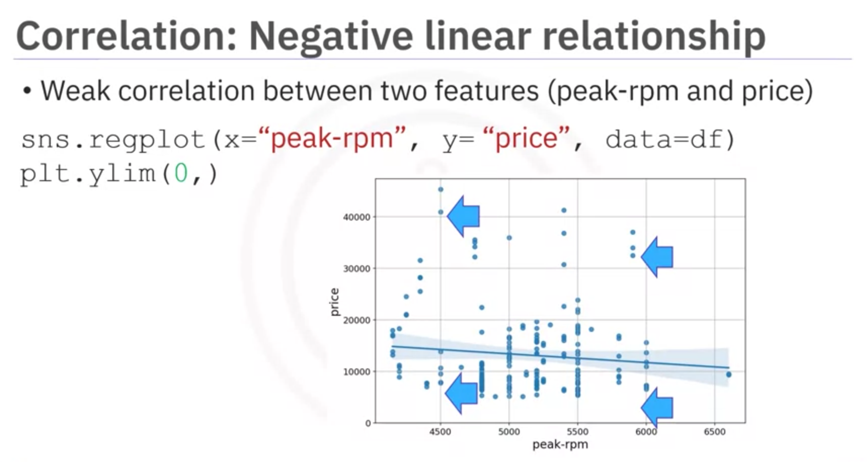
Explanation: RPM (engine revolutions per minute) does not strongly predict the price of the vehicle. Both low and high RPM values can be associated with a wide range of prices, indicating that RPM alone is not a reliable indicator of vehicle price.
Important Note
Correlation does not imply causation. It signifies a relationship but does not determine cause and effect.
5. Correlation Statistical Methods
Introduction to various correlation statistical methods. One method to measure correlation between continuous numerical variables is Pearson Correlation.
Pearson Correlation
Pearson Correlation is a statistical measure that quantifies the strength and direction of the linear relationship between two continuous variables. It assesses how much one variable changes when the other variable changes. In other words, The Pearson Correlation measures the linear dependence between two variables X and Y . The resulting coefficient is a value between -1 and 1 inclusive.
Pearson Correlation provides:
- Correlation Coefficient: Indicates strength and direction of correlation.
- p-value: Indicates certainty of correlation coefficient.
Interpreting Results
- Correlation Coefficient:
- Close to 1: Large positive correlation.
- Close to -1: Large negative correlation.
- Close to 0: No correlation.
- p-value:
- < 0.001: Strong certainty.
- 0.001 - 0.05: Moderate certainty.
- 0.05 - 0.1: Weak certainty.
- > 0.1: No certainty.
Example: Horsepower and Car Price
Example examines correlation between horsepower and car price using Pearson Correlation. Correlation coefficient is approximately 0.8, indicating strong positive correlation. p-value is much < 0.001, confirming strong certainty.
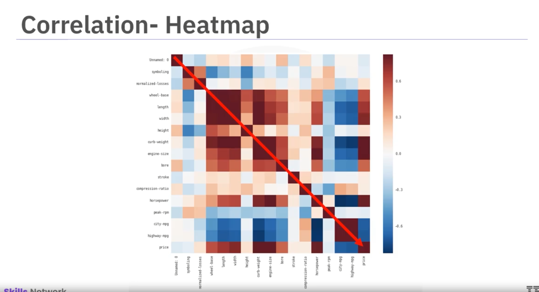
Correlation Plot
Heatmap visualizes correlations among variables. Color scheme indicates Pearson correlation coefficients. Dark red diagonal line shows perfect correlation (value of 1) between variables and themselves.
This heatmap offers overview of variable relationships and their link with price.
Note: To calculate the Pearson Correlation Coefficient and P-value, use statistical functions available in Python libraries like scipy.stats.pearsonr.
from scipy import stats

# Example calculation
x = df['horsepower']
y = df['price']
pearson_corr, p_value = stats.pearsonr(x, y)

print(f"Pearson Correlation Coefficient: {pearson_corr}")
print(f"P-value: {p_value}")
Chi-Square Test for Categorical Variables
Introduction
The chi-square test is a statistical method used to determine if there is a significant association between two categorical variables. This test is widely employed in fields such as social sciences, marketing, and healthcare to analyze survey data, experimental results, and observational studies.
Concept
The chi-square test assesses the association between two categorical variables by comparing observed and expected frequencies. It evaluates whether the observed deviations from expected frequencies could have occurred by chance.
Null Hypothesis and Alternative Hypothesis
- Null Hypothesis (𝐻₀): Assumes no association between variables, attributing differences to random chance.
- Alternative Hypothesis (𝐻₁): Assumes a significant association between variables, indicating observed differences are not due to chance alone.
Formula
The chi-square statistic (𝜒²) is calculated as:
where:
Cheat Sheet: Exploratory Data Analysis
Complete Dataframe Correlation
Correlation matrix created using all attributes of the dataset.
df.corr()Specific Attribute Correlation
Correlation matrix created using specific attributes of the dataset.
df[['attribute1', 'attribute2']].corr()Scatter Plot
Create a scatter plot using the data points of the dependent variable along the x-axis and the independent variable along the y-axis.
import matplotlib.pyplot as plt
plt.scatter(df['attribute1'], df['attribute2'])
Regression Plot
Uses the dependent and independent variables in a Pandas dataframe to create a scatter plot with a generated linear regression line for the data.
import seaborn as sns
sns.regplot(x='attribute1', y='attribute2', data=df)
Box Plot
Create a box-and-whisker plot that uses the pandas dataframe, the dependent, and the independent variables.
import seaborn as sns
sns.boxplot(x='attribute1', y='attribute2', data=df)
Grouping by Attributes
Create a group of different attributes of a dataset to create a subset of the data.
df_group = df[['attribute1', 'attribute2', ...]]GroupBy Statements
- a. Group the data by different categories of an attribute, displaying the average value of numerical attributes with the same category.
- b. Group the data by different categories of multiple attributes, displaying the average value of numerical attributes with the same category.
a. df_group.groupby(['attribute1'], as_index=False).mean()
b. df_group.groupby(['attribute1', 'attribute2'], as_index=False).mean()
Pivot Tables
Create Pivot tables for better representation of data based on parameters.
df_group.pivot(index='attribute1', columns='attribute2')Pseudocolor Plot
Create a heatmap image using a Pseudocolor plot (or pcolor) using the pivot table as data.
import matplotlib.pyplot as plt
plt.pcolor(grouped_pivot, cmap='RdBu')
Pearson Coefficient and p-value
Calculate the Pearson Coefficient and p-value of a pair of attributes.
from scipy import stats
pearson_coef, p_value = stats.pearsonr(df['attribute1'], df['attribute2'])